
“There are three kinds of lies: lies, damned lies, and statistics.” – Not Mark Twain
The quote was made famous by Mark Twain and others. However, they incorrectly attributed it to the British prime minister Benjamin Disraeli. Before Disraeli was prime minister, a doctor called M Price read a paper to an 1894 gathering in which he referred to “the proverbial kinds of falsehoods, ‘lies, damned lies, and statistics.'” An anonymous source from an 1891 query in Notes and Queries references various degrees of falsehoods ranging from fibs, lies, and the worst of all – statistics.
If we picked moments in modern history where statistics play a role in misinformation or confusing noise, the final month of a presidential election must be at the top of that list. The Dunning-Kruger effect (seen below) is rapidly distributed in nanoseconds via social networks, which spread new sources of slightly tilted information at a pace never imagined by Mark Twain or Disraeli. In the spirit of the various degrees of falsehoods, we thought we would share some data points that are being overlooked, for one reason or another. 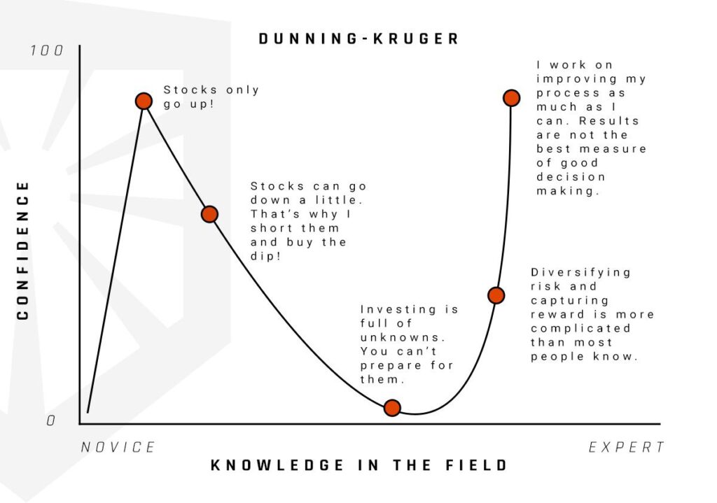 When it comes to the economy, jobs are a crucial indicator of overall health. People work, growth occurs. People do not work; contraction occurs. The concept is simple enough that everyone can understand it. As you know, how jobs data is reported is anything but simple. Communicating to a client why one segment is excluded from a figure, while another is not excluded, can be unhelpful semantics. However, those semantics when manipulated can create a massive discrepancy in economic outlook if one is not careful. Let’s level the playing field and look at total non-farm payrolls now that the final pre-election report has come. In the chart below, one could conclude that we have added a record number of jobs to the economy on a month-over-month basis.
 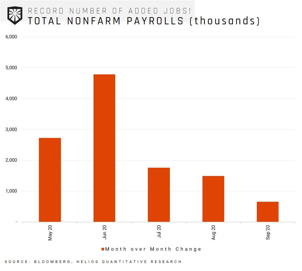 When we zoom out a bit and look at the jobs data, it looks like that two-month economic shutdown has recovered in a v-shaped fashion.
 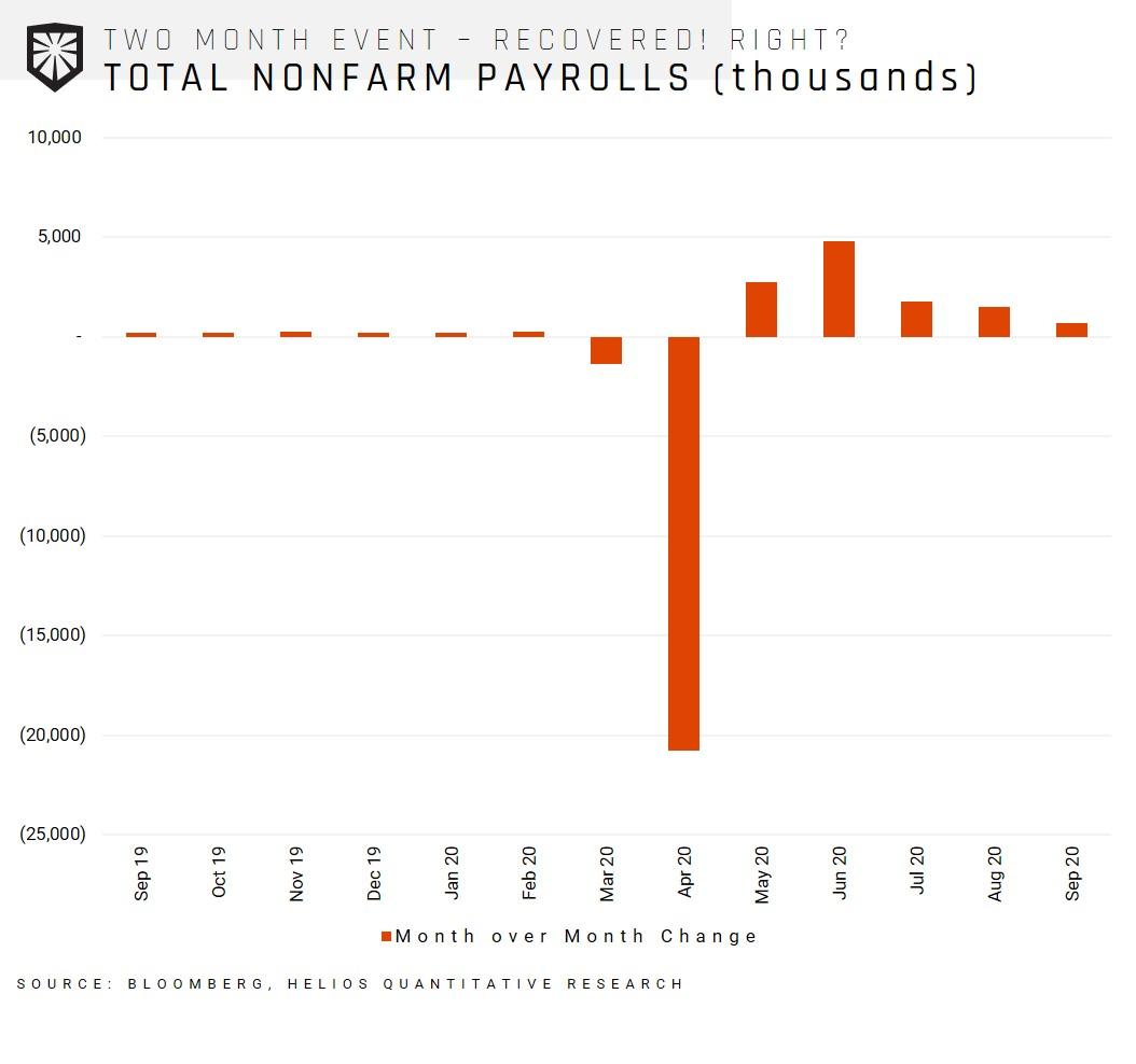 That was the good news; let’s look at the data we do not hear much about. The chart below shows that while the recovery has been helpful and robust, we are still employing nowhere near the amount before the COVID induced recession. The black line shows the total amount of non-farm payrolls as of October 2nd, and we still have a ways to go to reach our previous heights.
 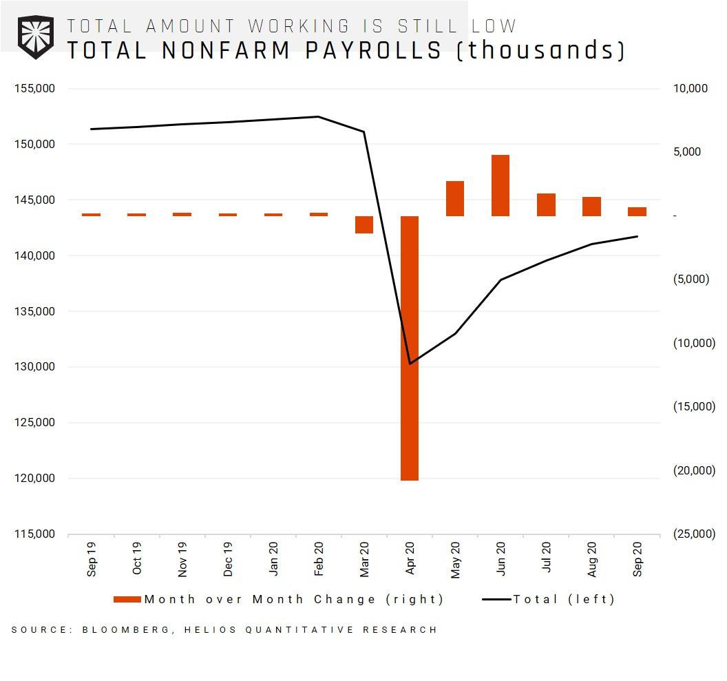 How far back in time do we have to travel to find a point where the economy employed these few people? 2015. The chart below shows our current level of non-farm payrolls in the dotted line and the total amount of non-farm payrolls over time in the solid line.
 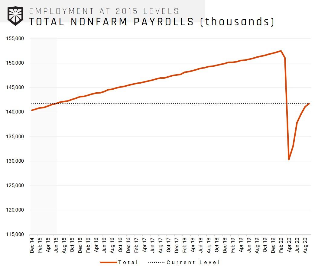 In September, we added 661,000 jobs (lower than the 800,000 Dow Jones estimate). Let’s be extremely generous and say that we continue at that exact pace indefinitely into the future with zero deceleration. How long would it take until we have as many jobs as we did before COVID? As the chart below shows, that date is the month of February 2022. You read that right, the year two thousand and twenty-two.
 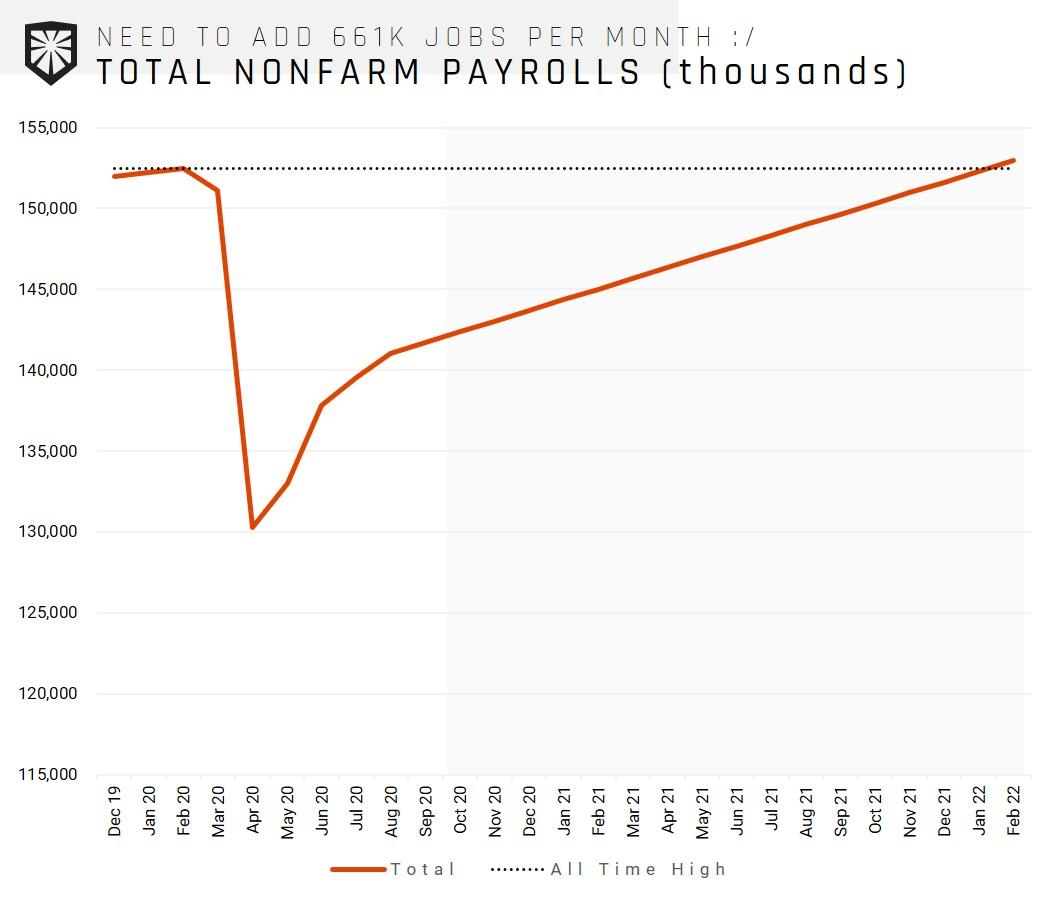 As a financial advisor – your clients depend on you to sort through the noise, find the signal, and convince them of your findings. While that may seem like an impossible task that no AUM fee can consolidate, we are here to help. Whether or not you vote blue, red, or purple, the generally smart thing to do is not invest according to an investment policy driven by political values. Quantitative investing notches an advantage when it comes to the behavioral flaws that are preyed on with great intensity during the fall months of an election season. We hope this note was helpful, have a great week!