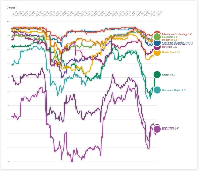
Isn’t that chart neat? What you are looking at is the YTD correlation of the eleven sectors represented in the S&P 500 to the overall S&P 500 index itself. More specifically, the chart plays from 12/31/18 to 12/18/19 and shows the three-month correlation of each sector. Why use a three-month correlation? Anything closer gets a bit choppy and less useful while anything further out misses some key details. Essentially, we want to smooth out the chart so that we can read it, but not so much that we miss the detail of the edges. So, what’s this chart showing us? In a year where the market is on the heels of having its best performing year since 1997, it’s a positive sign to see breadth in correlation. If every sector were tightly correlated to the index’s overall performance throughout the year, we would be concerned about the fragility of the market. However, when idiosyncratic risks present themselves, it is typically met with some diversity in correlation, which we see in the latter months of the year. As the S&P 500 reaches new all-time highs, investors can get nervous about pullbacks, and being able to show different vantage points can be helpful to frame discussions about where we’ve been, where we’re at, and what we think about its potential impacts.
Helios partners with Financial Advisors to help them grow their business, save time, and add scale to their services through enhanced asset management capabilities. Helios was founded in 2016 in Granite Bay, California.